Introduction
The Component Library is a pattern-based methodology we have built into the product to help you create templates using little or no code.
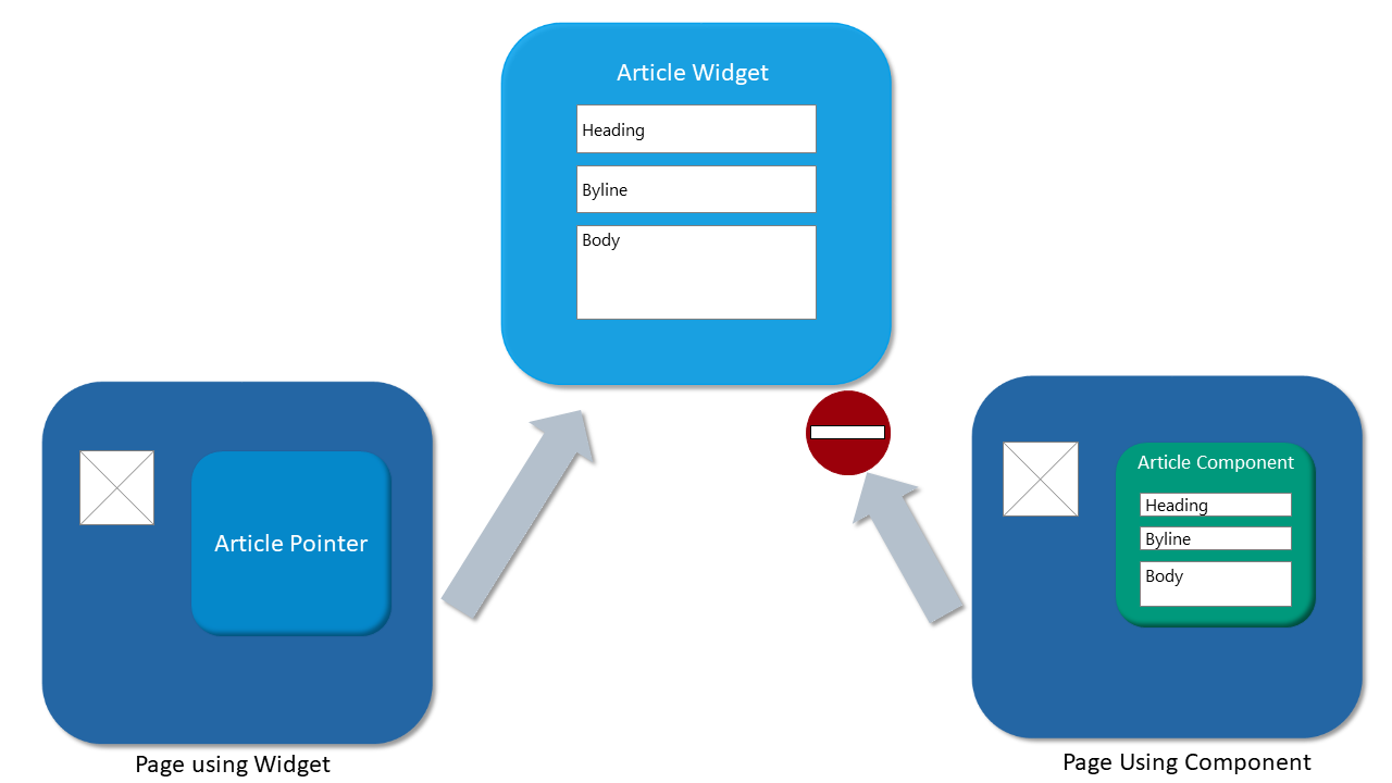
If you are familiar with Crownpeak templates, you are probably familiar with widgets - an implementation pattern that makes content creation modular.
So let's start with this core concept - Components are not the same a widgets.
Since you will likely use both, here's an overview of the differences.
- Components are added to templates
- Components store data directly on the asset
- You have to enter the data each time you use the component
- Widgets store data on another asset
- Users will link to them
- The data is stored only once
Where is Component Library
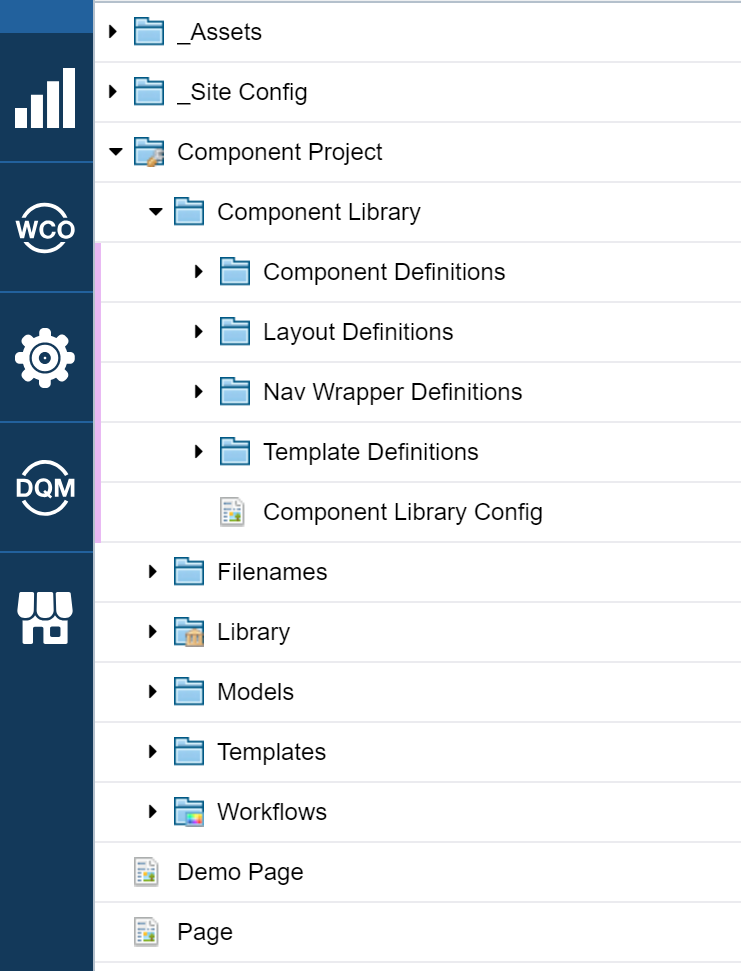
The Component Library folder is contained inside of the Component Project folder inside the site root.
For reference, the site root is a folder with the globe icon.
It is designed to be the home for a single site or domain so it can be easily configured for publishing, auto-beacons and search set up. It's also designed to be used with projects.
Only your developers need to have access to the Component Library folder.
Content authors, for example, do not need to interact with the library directly. They work with the assets that use the standard templates that the library generates.
Components are designed to work within the projects and site root structure. They support project branching to manage component updates.
We are currently in version 2.1 of component library. The improvements include
- Using code held in our Services Library
- Faster to set up and configure
- Support for Drag and Drop page design (Scheduled for general availability in Q3)
One last note - There is usually one installation per site root,but this will depend on your site and content strategy. Contact services for assistance with multiple installations.
What is included?
The Component Library installs with a set of definitions used to generate the standard CMS templates that power your site pages. There are 4 definitions included.
- Component
- Layout
- Wrapper
- Template
Using these definitions is the best way to deploy and manage your components.
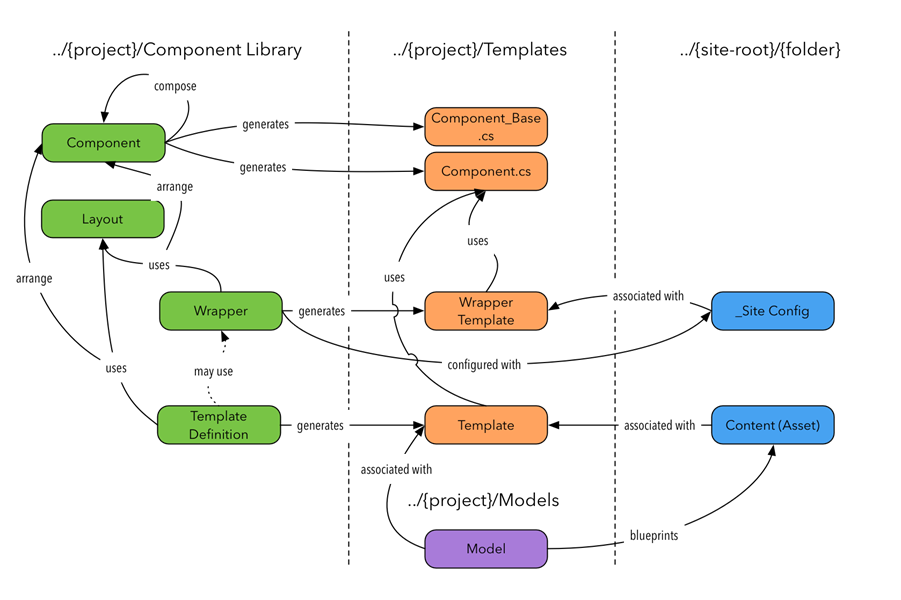
This chart illustrates how these definitions work to create standard templates.for your site.
To the left, are the relationships between the definitions files and folders.
Combined, these generate the library files, wrapper templates and site templates that are applied to your assets using Models and configured with the Site config.
Let's walk through the definitions.
The Component Definitions folder contains your site’s components.
- Components are discrete items that are combined to make up your page.
- They are reused on as many pages and templates as you need.
- Components can contain other components. This is a common and a recommended way to use them.
- They are created based on your site’s design and built into C# class files when saved.
- When complex tasks or customizations are needed, the generated components can be overridden with template code.
The Layout Definitions folder contains your site’s layouts.
- Layouts provide additional HTML markup to position and format your components
- These are the glue that sticks your components together and are reused a lot.
- These are not built into classes, but processed when a template is used
- Make as many layouts as your site needs
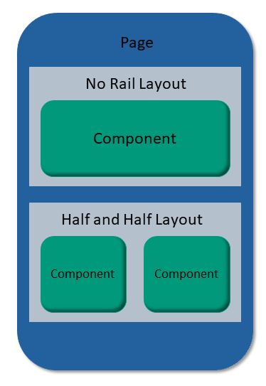
The No Rail layout is included in the Component library. It shows your component markup unaltered.
It's a good choice for full-width items and is the most common choice when building a site page.
A layout wraps the component markup with extra items, so this is how you would display your components using a front-end framework such as Bootstrap. As an example, you would use the layout to wrap your components with HTML to apply a grid layout. In Bootstrap, you might use grid classes like col-md-6 to achieve this.
The Template Definitions folder contain your component templates which
- Use Components and Layouts to create CMS templates
- Take care of generating the input, validation and output experience for you
- Use Wrappers to render the final output to the page
- Are generated into standard CMS templates when they are saved
Template definitions DO NOT make filename, url, search_g2_*, etc. templates for you. If you need these template files, you need to add these after you generate each template.
Finally, wrappers are available in the Nav Wrapper Definitions folder. These definitions
- Are like CMS Nav Wrappers, a convention for standard templates
- Include your site's common navigational and boilerplate elements
- Are also built into standard CMS templates when they are saved
Note, CMS Nav wrappers and Component Nav Wrapper Definitions
- Are often the same across all pages
- Help to ensure the consistency of your site
Components in detail
Here are the basic steps to create a component in the Component Definitions
folder
- From the top menu, select File > New > Component and enter a name
- It’s not easy to rename components, so choose carefully
- Paste in your markup
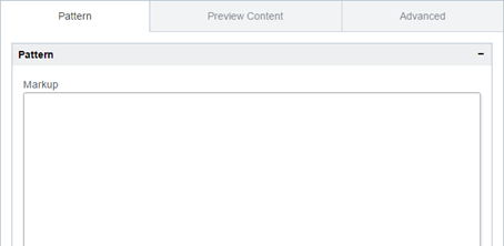
- Replace user-editable content with field definitions
- For example,
{name}represents a field called “name” - Separate multiple words with underscores – e.g.
{header_name} - Labels will be created automatically – e.g. Project Name
<div class="col-lg"> <h2>{header_name}</h2> <p>{section_content}</p> <p></p> </div>- Try to keep all your components at the same level
- For example all inside
<div class=“column”> - Once you’re done, click Save
- Refresh the view
- Below the Markup field, expand the Component Details panel
- Here you can confirm and configure your components
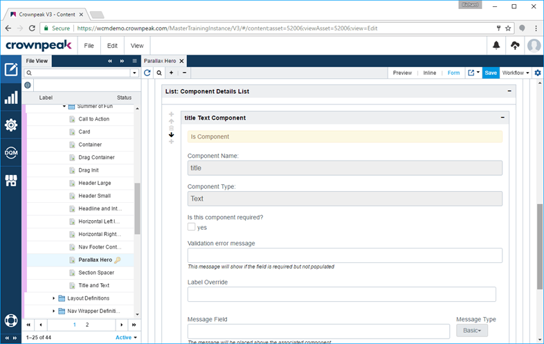
- Choose a Component Type for each component
- You can specify the type automatically with
{body : Wysiwyg} - The default will be Text if you don’t specify one
- Make the component required if a value must be provided
- Change the label displayed for the component data entry field
- Add a message above the component. This is useful for grouping fields
The first time you save, the Component Library creates two C# class files in Component Project/Components.
You can see the names of these classes on the Advanced tab.
For example, if your component was called “Test”, you'll find these library files are generated
- Components_TestBase.cs
- Components_Test.cs
|
Important Note: Never edit the “Base” class – this is regenerated on each save |
The other class is available for you to edit to customize your component’s behavior.
Put logic in here to supplement or replace:
ComponentInput()– for the input experienceComponentPostInput()– custom validation run when the user clicks SaveComponentOutput()– control exactly what your control outputs
Wrap or replace the base method call depending on your requirements
Layouts in detail
Found in the Component Library/Layout Definitions folder, these are useful for configuration components.
- Select File > New > Layout and enter a name
- Enter markup – use
{coln}for your columns
<div class="row"> <div class="col col-md-8">{col1}</div> <div class="col col-md-4">{col2}</div> </div>
- Up to four columns are allowed in each layout
- Select which column to use when placing a component on a template
- As with components, try to keep your layouts at the same level
- For example, all inside
<div class=“container”> - If you don’t want output, don’t enter any markup
Wrappers in detail
Create a Wrapper in Component Library/Nav Wrapper Definitions
- Select File > New > Wrapper and enter a name
- In the Components tab, add your sections
- Choose Header or Footer to select where the sectin will be placed on the page.
- Each section has a layout – use “no rail” if you don’t need markup
- Each section corresponds to a tab on the Site Configuration template
- Sections can contain one or more components
- Input-only components are useful here
- Open the Wrapper tab to enter markup to surround your components
- Header, Before content, After content and Footer
- In the Header and Footer, use special markup
{css}and{javascript}to include code and styles - If you need finer control
{css:1}etc. allows access to each item - Use the Settings tab to choose a name and select the destination folder
- Always pick Component Project/Templates
- Choose an asset to use for configuration
- This will use the template and act as your _Site Config asset
|
Note You don’t have to use the Nav Wrapper Definition - you can still create a nav-wrapper manually. This is useful if you have more advanced requirements. For example, create a wrapper manually when you want to create an ASP.NET master page, or a Java Tag page. We strongly recommend this approach, otherwise you have to republish every page when your navigation or site config changes. Tips for manual wrapper templates:
|
Templates in detail
Create a Template in Component Library/Template Definitions
- Select File > New > Template and enter a name
- In the Components tab, enter your sections
- Each section has a layout. Use “no rail” if you don’t need markup
- Each section corresponds to a tab on the Input template
- In Customize you can also choose to continue on the previous tab. Useful for controlling the input experience
- Sections can contain one or more components
- Choose which column to use for your component based on the layout
- Enter a message to show above the component if the page is complex
- On the Wrapper tab, choose the wrapper to be used for this template
- If you manually create a nav wrap, choose Custom Built Wrapper
- On the Settings tab, make sure Create is checked
- Provide a name for your new template
- Select Component Project/Templates as the folder to use
- Check Enable Page Metadata to get meta tags for SEO
- Click Save to create your template
This creates a new template with input.aspx, post_input.aspx and output.aspx template files
|
Note: Look, but don’t touch – changes will get overwritten without warning |
Make these adjustments to complete your template
- Add filename.aspx and url.aspx to your template
- Copy from another template in your site
- These ensure your asset has a consistent file name when published
- Other template files may also be copied as required
- Create a model using your new template and apply it to a folder
- Models go in Component Project/Models